UI form modeling components
| 🌐 This document is available in both English and Ukrainian. Use the language toggle in the top right corner to switch between versions. |
This section provides an overview of the Updated components for UI form modeling. We recommend using these components to develop the regulations more efficiently and improve the user experience. The updated components of the standard Form IO set provide more flexibility and expanded functionality.
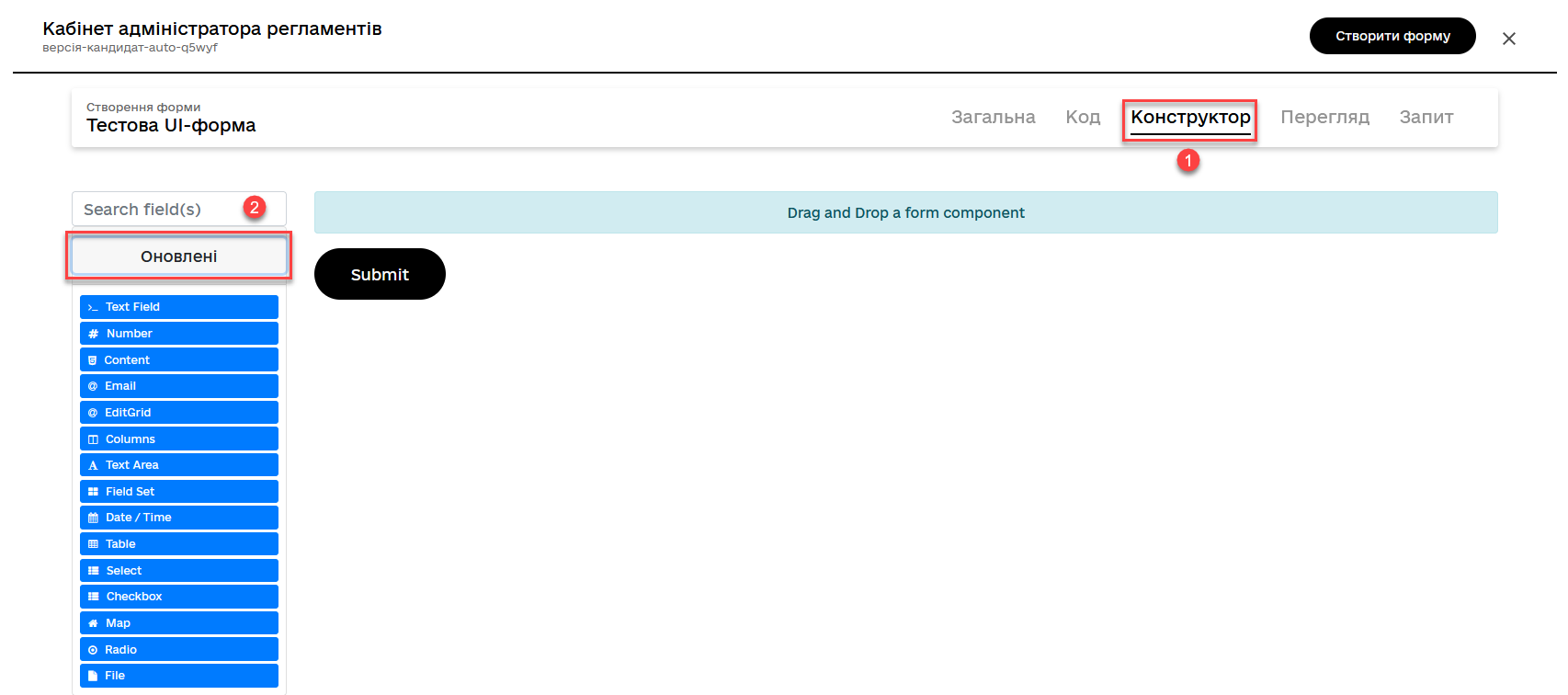
You can use these features in the Administrative portal > UI forms (creating or editing) > Builder > Updated.
| Component | Description |
|---|---|
A component for text input. Used for short fields such as a name, address, and so on. |
|
A component limited to the number of type values. |
|
A component for displaying static content such as a text, images, or HTML. |
|
A specialized text component for entering and validating email addresses. |
|
A component for creating, editing, and deleting rows in a table. |
|
A component for creating column layouts on a page or within other components. |
|
A component for longer text input. |
|
A component that groups several fields or components for a better organization. |
|
A component that enables users to select a date and/or time. |
|
A component for creating and displaying a table. |
|
A component that enables users to select one or more options from a predefined list. |
|
A component that enables users to select one or more options from a list. |
|
A component for displaying geographic data on an interactive map. |
|
A component that allows users to select only one option from a predefined set. |
|
A component that enables users to upload files to a server. |