Content component
| 🌐 This document is available in both English and Ukrainian. Use the language toggle in the top right corner to switch between versions. |
1. Component description
Content component is designed to display a block of text with headings, subheadings, and other tools for visual text formatting. This component can be used to create forms with informative messages. For example, with information about an error, success or just a hint on how to act to the user.
2. Main functions
-
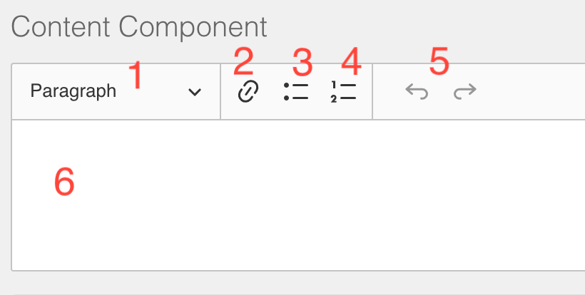
Control element for text size and style, the following options are offered to the user - Paragraph, Heading 1, Heading 2, Heading 3
-
An element to insert into the text of links
-
Element to create a bulleted list (not numbered)
-
Element for creating a numbered list
-
Control element for canceling the last changes made (Undo and Redo)
-
A place to display text and format it
2.1. Template syntax support
The component also has support for inserting dynamic content via double curly braces syntax
{{data.someDataToShow}}nside the curly braces, the JS syntax and most of the variables that are available in other JS plugins are supported. In detail here.
For example, this is how can get the current date in the message content
👍Hi!
З {{new Date().toLocaleString()}} You've granted an access to the registry| The template syntax works only with static data, if any data changes while working with the form (text entered into fields, the result of http requests), then this data on the Content component will not be updated |
2.2. Component settings
-
Display
-
API
-
Conditional
-
Label: The name of the component that appears next to it.
-
Hidden: An attribute for fields that are hidden from the users but are still part of the form and are submitted along with the form. Don’t forget to clear the Clear when hidden option; otherwise, any value of this component will be empty.
-
Hide Label: disables the display of the component name
-
Property Name: the name of this field for an API endpoint that is not functional for this component
-
Advanced Conditions: Here, you can configure advanced conditions for the component. For example, these conditions determine when a component becomes visible based on other components or their values.
This function uses JS plugins. For details, see Variables in JavaScript insertions. -
Simple: Performs the same tasks as Advanced Conditions but allows you to specify conditions in a simpler format.
3. Data format
This component does not create or edit any data, it is for display only.
4. Use cases
Most often, the component is used to create message forms or simply to visually design blocks of text. It is also convenient to use to visually separate blocks on large forms for section headings